Thomas Rackowe Cork

I connect people, business, and technology to shape solutions that deliver meaningful impact.

Featured work
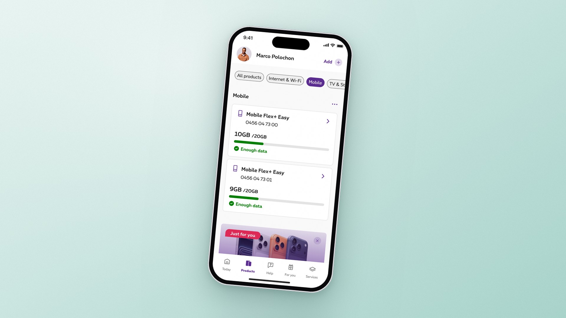
  • A service-first foundation for Proximus' app
    Proximus, 2026

    A service-first foundation for Proximus' app

    Proximus, 2026

    Proximus' app had grown into a super-app, and its core value had blurred along the way. This project refocused it on what users needed most: reassurance that everything works, and the confidence to act when it doesn't.

    Problem

    Proximus' app had expanded into a super-app, with services well beyond telecom. In the process, its core relationship with users had blurred. Engagement declined, product-related support demand grew, and in-app conversion fell short of business targets. Testing the live app revealed why: information and actions were fragmented, and the commercial strategy had taken precedence over user needs. Over time, users had stopped seeing the app as a place where anything useful could be done. The challenge was not to redesign a tab, but to redefine how users interact with Proximus: how they manage their products and services, and what they expect from their app.

    My contribution

    As a lead designer, I worked closely with engineering and cross-functional partners. I began by aligning the team on objectives and success metrics, so that design decisions rested on evidence rather than opinion.

    Two rounds of concept testing revealed a clear priority: before anything else, users wanted to know that their services were working. I repositioned the product experience around that need, turning a passive list of links into a real-time health overview. Together with engineering, we redefined the logic behind statuses, issues and recommendations across every product. Informed by research, I shaped a prioritisation model that brings only actionable issues to the surface, each paired with a clear path to resolution. No alert leaves users at a dead end.

    To make this sustainable, I introduced a consistent page architecture across all products, designed as control panels rather than storefronts. It gave users a predictable way to manage their services and gave Proximus a framework that can scale as its portfolio evolves.

    Impact

    This first phase laid the foundations, in both experience and technology, with the app now rebuilt in React Native. Product and service management follows a user-validated hierarchy, in which usage and status lead and commercial content plays a supporting role. The new experience is live across every product, with TV now fully native.

    Its broader value lies in the model itself: a shared logic for status, actions and communication that absorbs new products without added complexity. The work continues, moving from reassurance towards proactive, personalised support, with agentic capabilities now in development.

    Three workshop frames on a dotted grey canvas, filled with sticky notes and headed Upselling / Conversion, Troubleshooting and Usage, each listing the objectives that define success for that pillar.
    Before any design, we defined what success meant for each pillar of the app: conversion, troubleshooting and usage.
    A section of a concept workshop board: Concept 1 and Concept 2 as product overview screens, with annotations on component structure, proactive messages, a diagnose centre and filtering, team votes, and feedback sticky notes.
    The first concepts, explored and challenged with the team before testing with users.
    When something breaks, the app flags it and guides users step by step to a fix.
    Four product pages floating side by side on a soft lilac field: Internet and Wi-Fi with Share Wi-Fi, Connected devices, network health and usage; the Internet Box with its connection status and tools; Mobile with usage rings and options; and TV and Streaming with subscriptions and equipment.
    Each product now has its own home, with its status, usage and services in one place.
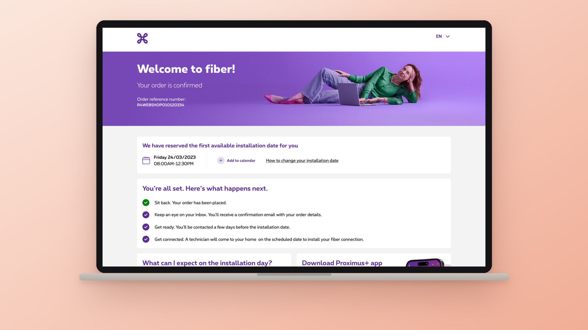
  • Digital Acquisition & Checkout Redesign
    Proximus, 2024–2025

    Digital Acquisition & Checkout Redesign

    Proximus, 2024–2025

    Proximus was losing ground online: its digital sales share fell while support calls rose. The challenge was not to optimise the checkout, but to redefine how customers order.

    Problem

    The decline had no single cause. Ordering flows were complex and inconsistent, designed around edge cases rather than the majority of customers. Proximus positioned itself as fibre-first, yet many customers were not eligible for fibre and only discovered this late in the journey. Key steps such as identification and installation added friction and offered little transparency. The result was high drop-off and greater demand on support.

    My contribution

    As a lead designer on this project, I owned the acquisition flows, from product pages to order completion. With cross-functional teams, I anchored the redesign in one principle: radical simplification for the majority of customers.

    The first priority was relevance. I led the redesign of the address check, so customers saw only the offers available at their address from the start. This removed a major source of late drop-off, without frustration for those outside fibre coverage.

    Two moments still stalled many orders. The first was identification, which customers had to complete before an order went through. The step was managed externally, clumsy on mobile, and gave little visibility into drop-off. Yet over 80% of completed orders relied on itsme, Belgium's leading digital identity app. That data, user insights and its stronger security made a clear case for itsme as the default. I then redesigned the step with the itsme and security teams.

    The second moment was the installation step. Most customers waited for a technician, often with long delays, at a cost to them and to Proximus. With engineering, I reconfigured the logic behind self-installation and integrated it into the checkout, with guidance that made it a confident choice: faster for customers, and less costly for Proximus.

    Impact

    Completed orders rose by 17% and identification completion by 15%. Self-installation adoption doubled, and support calls fell significantly. Beyond the numbers, digital regained its role as a primary sales channel. The project also changed how teams worked: design moved from execution to a strategic role, shaping business outcomes alongside product and tech.

    Customers could check their address straight from a pack, and see what was available to them before choosing.
    Before: the old identification step on mobile, annotated: managed outside Proximus as a third-party iframe in the checkout, with around 35% drop-off, and methods listed as equals with none recommended.After: the new identification step on mobile, annotated: itsme as the default, recommended up front, and a store as the fallback for users without itsme.
    Identification before and after: a third-party step with around 35% drop-off became an itsme-first step, with a store as the fallback.
    Self-installation became a confident choice inside the checkout.
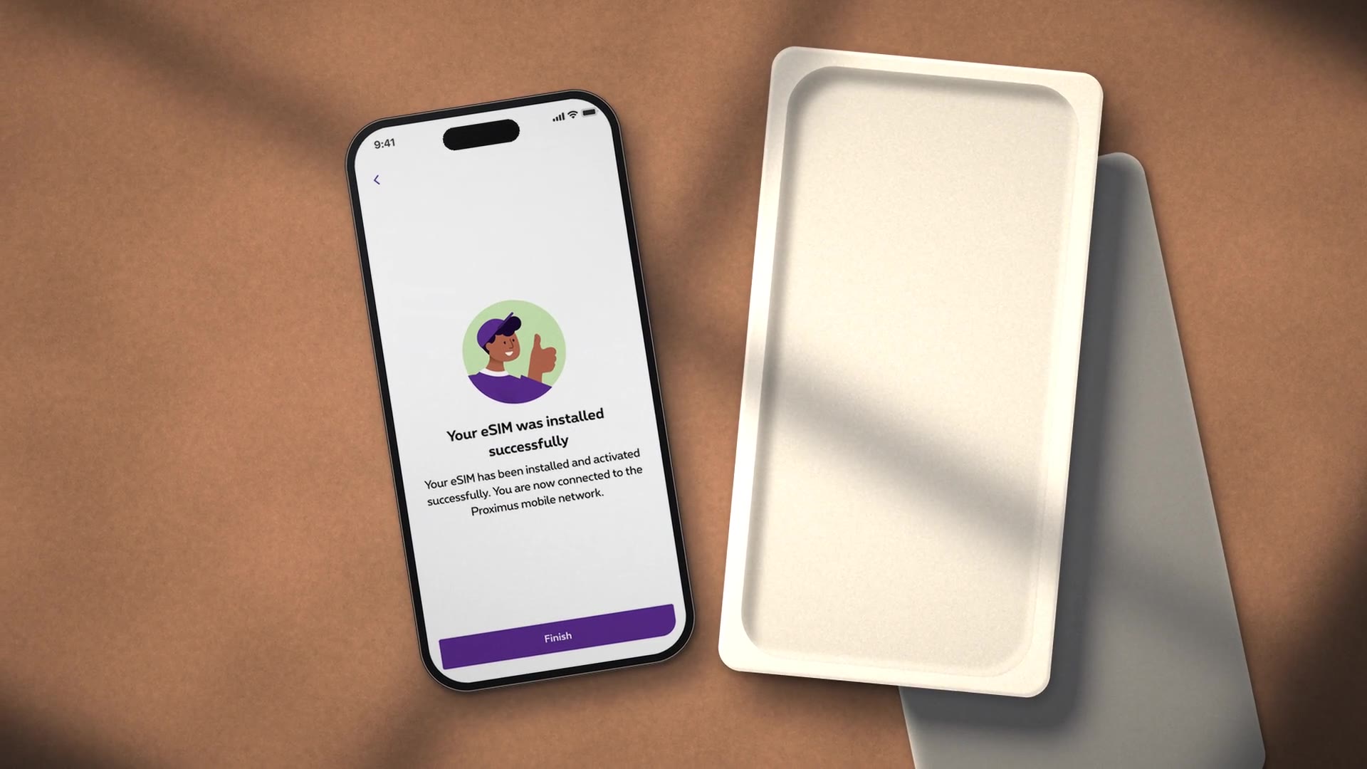
  • A scalable activation model for eSIM

    Proximus, 2023–2025

    A scalable activation model for eSIM

    Proximus, 2023–2025

    The move to eSIM was not driven by customers, but by device manufacturers. Proximus had to make mobile connectivity fully digital, and fast.

    Problem

    eSIM promised instant connection, yet Proximus still relied on physical processes. New customers had to wait for a paper QR code by post, while existing customers had to visit a store to switch to an eSIM. Both undermined the fully digital nature of eSIM technology and created friction for customers. Meanwhile, Apple and other manufacturers progressively rolled out eSIM-only devices. The pace was set externally, and Proximus was not ready.

    My contribution

    I began with the foundations. With product and engineering, I mapped the backend and provisioning systems to understand how a manual, physical process could become a digital one. On that basis, I designed a fully digital onboarding experience across the online sales flows, and a native activation journey in the Proximus app. Clear guidance and real-time feedback built trust in a process that was still unfamiliar.

    I designed the activation flow as a reusable foundation. This allowed me to extend it to a native SIM-to-eSIM swap, so existing customers no longer needed a store. When manufacturers introduced Quick Transfer, I adapted the relevant Proximus touchpoints to support it, so that statuses and next steps remained clear for customers throughout.

    Impact

    Onboarding and activation time fell from days to minutes, with no reliance on a physical SIM card. As manufacturers like Apple redefined how people set up and connect their devices, Proximus customers could follow that shift without friction. Proximus also became the first Belgian operator to launch Quick Transfer, with over 14,000 eSIM activations in the first month. Above all, the work established reusable foundations, which paved the way for Proximus to extend the experience as customer needs and industry standards evolve.

    Both sides of the old Proximus eSIM card: setup steps on the front, and a QR code with activation codes on the back.
    Before: new customers waited for a QR code card by post.
    The full service blueprint for ordering and activating an eSIM, from product page to eSIM installed.
    The service blueprint mapped each step from order to an active eSIM.
    Two screens from the Proximus eSIM page: the introduction, and a device compatibility check that confirms an iPhone 14 supports eSIM.
    The eSIM page explained the technology and let customers check their device first.
    The SIM-to-eSIM swap hands over to the same activation flow.
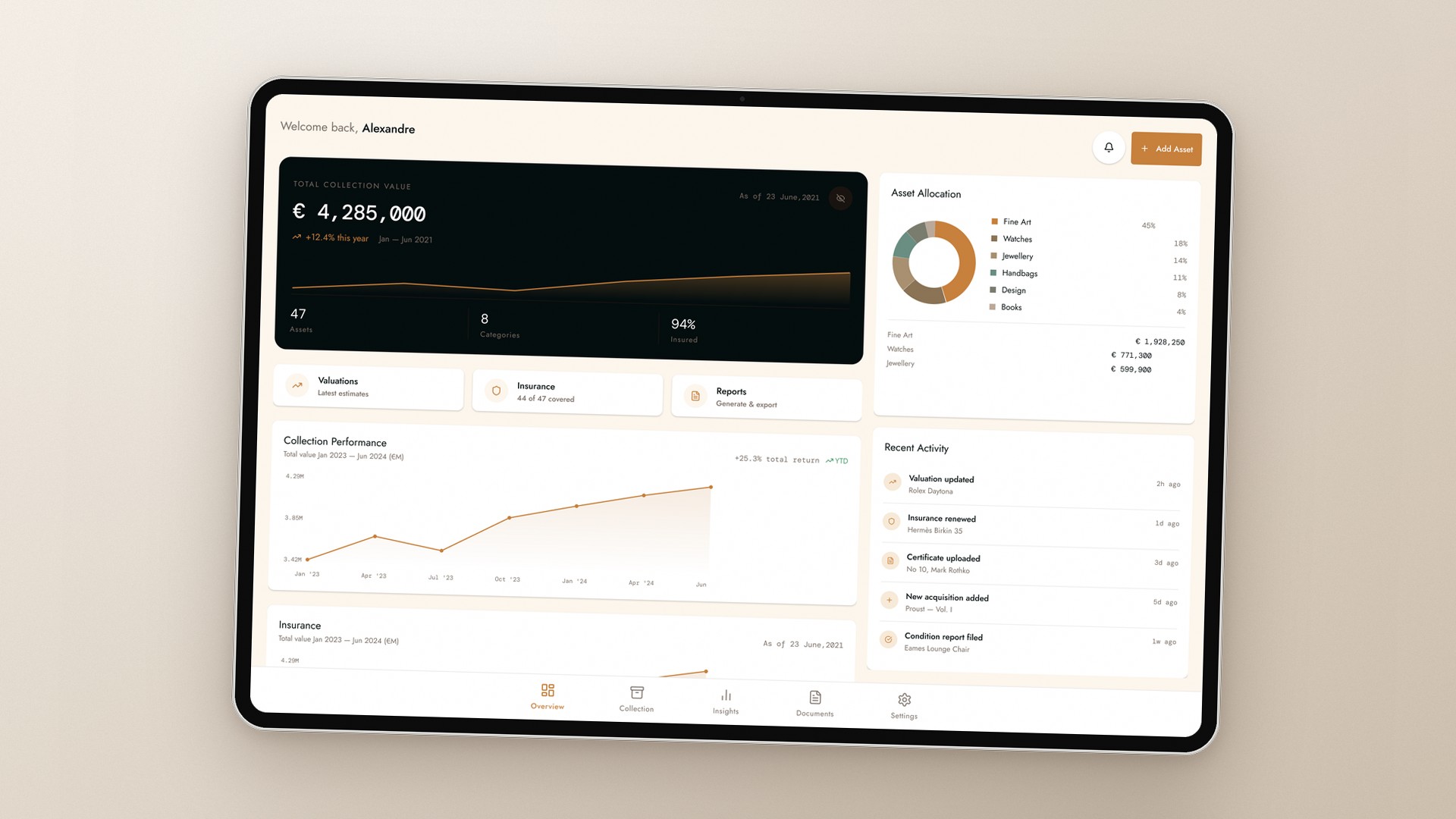
  • Product strategy for an art platform in transition

    Arteïa, 2021

    Product strategy for an art platform in transition

    Arteïa, 2021

    Arteïa was built around the NFT boom. When the market shifted, the challenge was no longer the improvement of the product, but its redefinition.

    Problem

    Arteïa had tried to be everything to everyone. It addressed galleries, artists and collectors alike, and anchored much of its value in NFTs just as interest declined. The result was a product without a clear audience or a durable reason to exist.

    My contribution

    I joined as a UX/UI designer to extend core features. However, exploratory interviews to understand what users valued and what was missing soon challenged that brief. Artists saw little need for the platform, and galleries lacked the operational basics to adopt it. Collectors, by contrast, already relied on it and made up 75% of customers. The product had to be built around them.

    I translated this into a roadmap within the current architecture. I redesigned the catalogue around multiple categories, so collectors could keep a single record of everything they own, from art to watches, cars and books. I also designed the foundations of the Arteïa mobile app to put key information at hand, with desktop as the reference platform.

    Impact

    Arteïa did not abandon NFTs or digital authentication. It did, however, gain what it had lacked: a defined core audience, an evidence-based roadmap, and a clear vision of the platform as a home for an entire collection.

    Two Arteïa mobile screens on a soft olive field: an overview with the total collection value, growth chart and quick actions, and a collection grid filtered by category, with a painting, a watch, a handbag and a book.
    The foundations of the mobile app: the collection's value at a glance, and every category, from art to watches, in one record.

About me

I took the scenic route into design. I studied social anthropology before building my career in the contemporary art world as a researcher, advisor, and artist liaison for a leading gallery. Few things prepare you for stakeholder management quite like a room full of artists and collectors.

Along the way, I developed a lasting curiosity about people, their behaviour, and the systems they operate within. I'm interested not just in what people do, but why they do it. That curiosity still shapes how I approach my work today.

I work across business and customer challenges, from framing and understanding problems to shaping and delivering solutions. Research, critical thinking, and collaboration are central to how I work, alongside a drive to keep learning, experimenting, and exploring new ways of doing things.

I do my best work in multidisciplinary teams, where different perspectives challenge assumptions, lead to better decisions, and ultimately deliver greater impact.

Portrait of Thomas Rackowe Cork