
Winning back eShare at Proximus
This case study explores how redesigning ordering flows and refining digital strategy is helping Proximus reverse eShare decline and boost conversion.
Digital Strategy
E-Commerce
UX/UI
Setting the Stage
As Proximus faced a consistent quarter-over-quarter decline in its digital sales share (eShare) and a rise in calls to back-office agents, it became clear that the existing digital ordering experience was falling short.
Shifts in the Belgian telecom market, evolving consumer behaviours, and increased price sensitivity driven by broader economic pressures further exposed the limitations of the legacy checkout.
Furthermore, the legacy checkout flows failed to align with common user expectations, user mental models and existing customers - resulting in a confusing, inefficient process that catered more to edge cases than to the majority of users.
In response, a dedicated task force combining product, tech, and design was mobilised to redesign and rebuild the checkout experience. Our goal: to reclaim lost eShare by creating a more intuitive, streamlined ordering journey that boosts conversion and reduces user frustration.
A different set up
To tackle the challenge, a dedicated task force of internal experts and external consultants was formed to focus solely on redesigning the Proximus checkout experience. While our dedicated team worked independently, we closely collaborated with existing Proximus squads to align on shared product domains.
What set this initiative apart was not just what we were building, but how we were working. Collaborating side by side with product, tech, and design in one integrated team was a significant departure from the traditional organisational setup at Proximus.
I joined the team as one of the core product designers, initially focusing on the acquisition flows. We worked incrementally - redesigning the end-to-end journey for one product type at a time and progressively scaling the solution across the broader roadmap.

A roadmap rooted in impact
The roadmap for the redesign was pre-defined by senior leadership and product experts, with a clear focus on business impact. Product increments were prioritised based on their conversion potential and attachment rate, ensuring early efforts targeted the most commercially valuable flows.
Although this was a newly formed initiative, it built upon an earlier MVP that had been launched months prior—serving both as a foundation and a benchmark to challenge. My initial design focus centred on the end-to-end ordering journeys for Proximus Packs and standalone internet products, two of the highest-priority flows in terms of strategic importance and customer reach.

Radical Simplification
One of the key guiding principles of the redesign was “I radically simplify” — one of the four core pillars of Proximus culture. More than just a value, this principle served as a mindset and north star, shaping both our design decisions and the underlying technical architecture.
This principle called for a fundamental rethinking of how digital experiences are structured: prioritising clarity, consistency, and ease-of-use over complexity and exception handling. It influenced how we approached each product increment and guided the development of a sharper, more focused digital strategy.
For Pack and Internet products, this meant aligning user flows with both business objectives and user expectations, while placing Proximus’ core differentiator—its fiber network and unmatched internet speeds—at the heart of the experience.
Through close collaboration with the in-house customer data team, we validated that Belgium’s competitive and evolving telecommunications market, fiber remained the key driver of customer choice. This insight anchored our strategy and ensured the redesigned journey highlighted Proximus’ unique strengths in the most compelling, user-centric way possible.

Balancing Strategy with Reality
Proximus’ “fiber first” strategy was a key driver in how we approached the redesign of the Internet and Pack product pages, with the goal of putting the company’s fiber offering- its core USP - front and centre.
However, at the time of the project, only around 35% of Belgian households were actually eligible for fiber. This posed a strategic challenge: how could we promote Proximus’ differentiator without frustrating or misleading the majority of users who couldn’t access it? To navigate this tension, we anchored our approach around a single, essential question:
How might we strike the balance between championing our fiber first strategy while still delivering a relevant and valuable experience for non-fiber eligible customers?
This question shaped both our design decisions and technical solutions, ensuring we remained aligned with business goals while addressing the practical realities of the market.

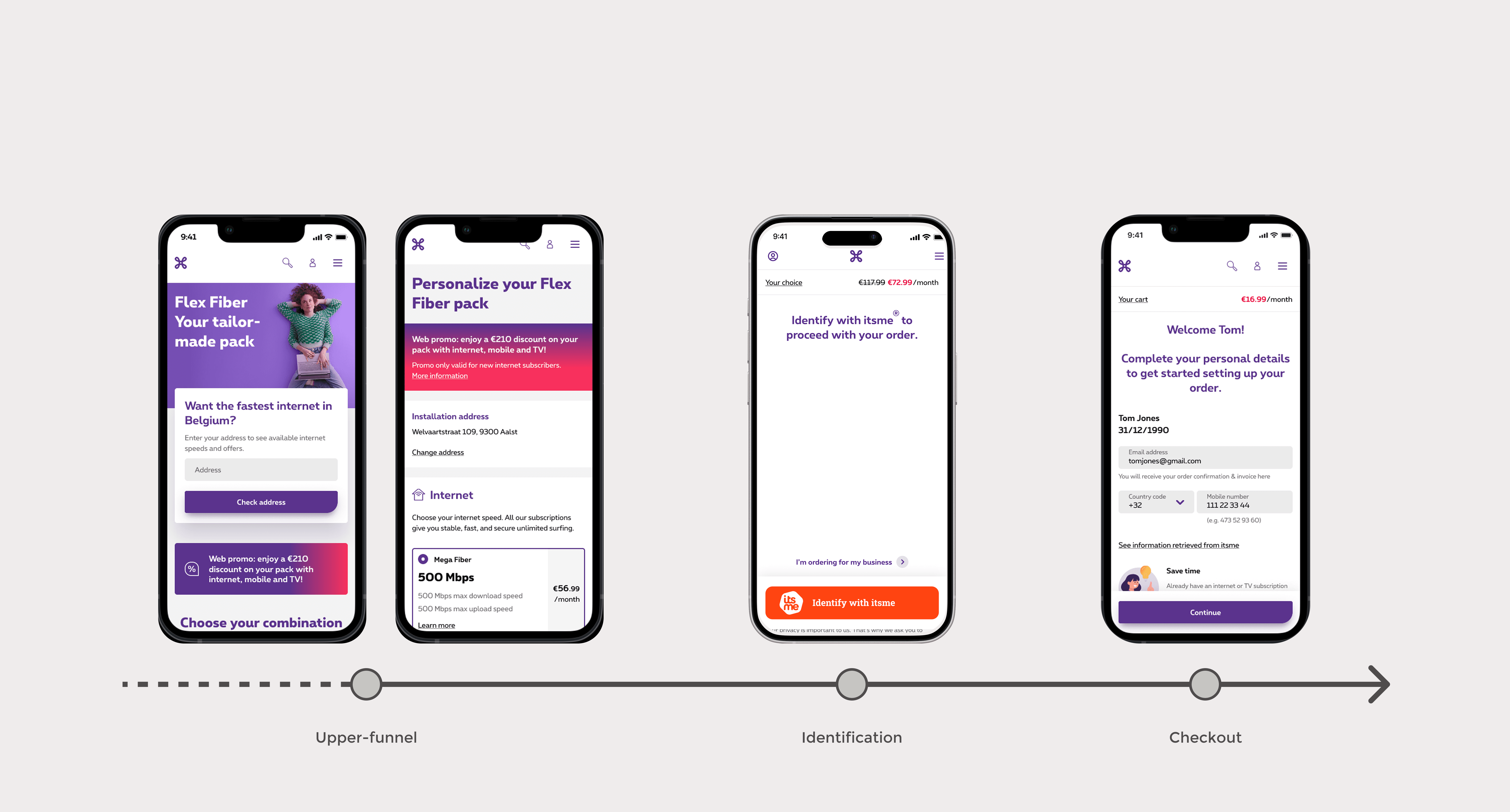
Design decisions: Upper funnel
Our digital strategy—rooted in personalisation and Proximus’ “fiber first” ambition—directly informed the key design decisions we made in the upper funnel of the ordering process.
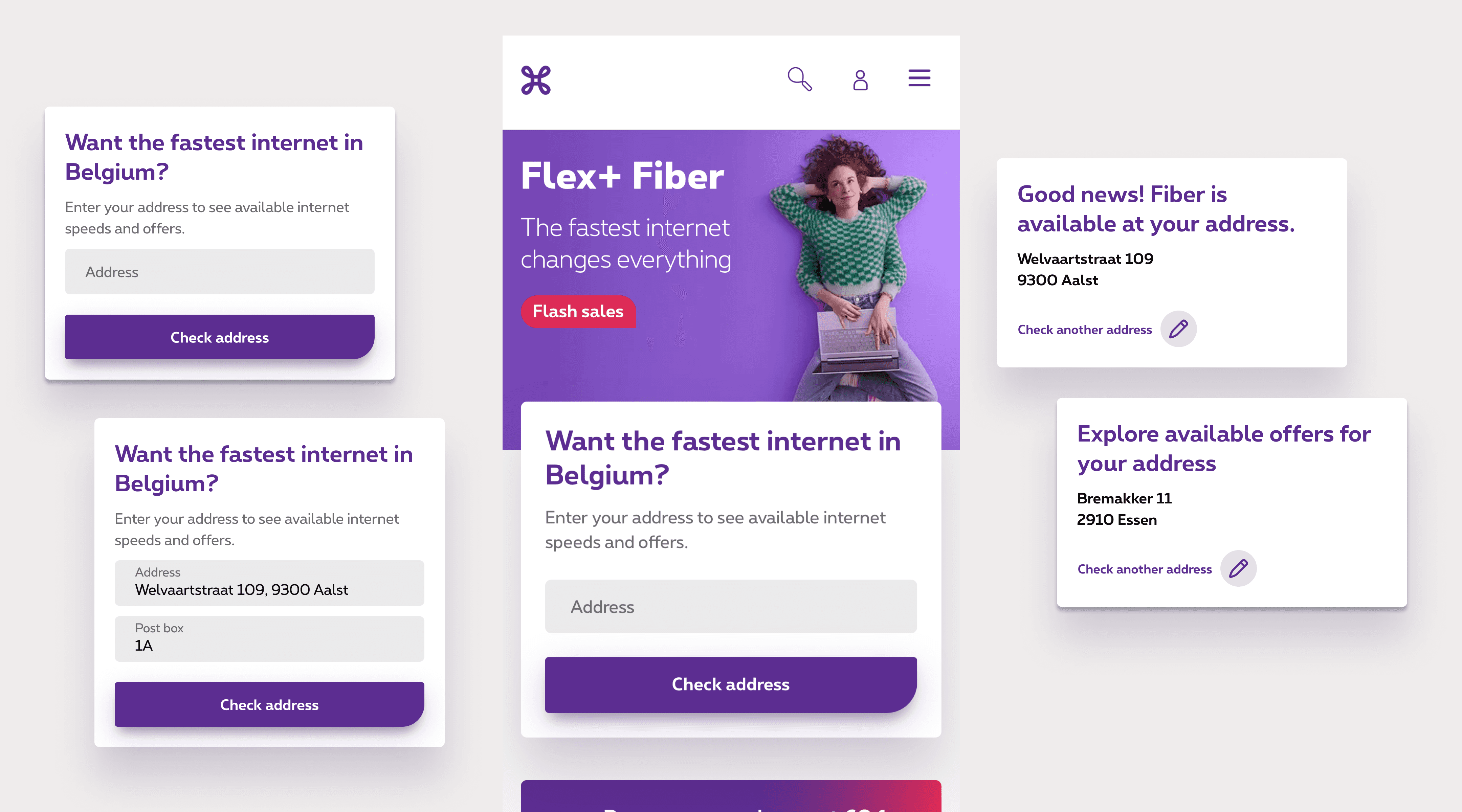
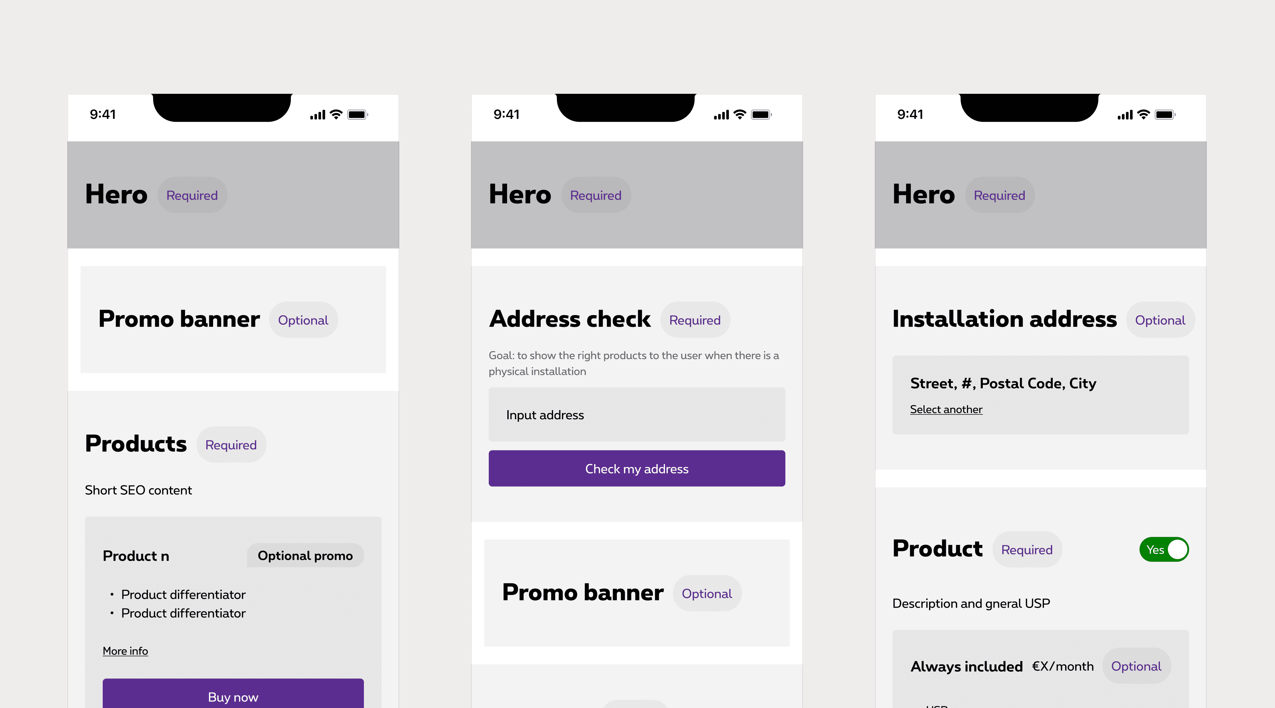
One of the most impactful changes was the introduction of an improved address check. Rather than framing this step as a binary “fiber eligibility” check, we repositioned it as a way to provide personalised offers based on a user’s address. This reframing removed any negative connotation associated with being ineligible for fiber, and instead created a smoother, more relevant entry point into the journey.
Users were presented with accurate offers from the start, reducing confusion and eliminating the legacy issue of auto-switching products later in the funnel—a moment previously responsible for major user drop-offs due to changes in price or specifications.
Keeping Consistency
On the product pages themselves, we focused on clarity, consistency, and removing unnecessary friction. The legacy experience was overloaded with banners, inconsistent components, and an overwhelming number of CTAs - often described as walking into a noisy market.
Through a combination of behavioural data analysis and collaborative content workshops, we defined a streamlined, scalable page template. We eliminated underperforming elements, gave prominence to content users most interacted with, and aligned our designs with SEO and tagging needs.
The result was a cohesive, user-focused layout that not only improved usability but also provided a clearer framework for future iterations. These templates were built in Figma and into our CMS to ensure consistency across teams and ease of implementation by stakeholders and developers alike.
Identification
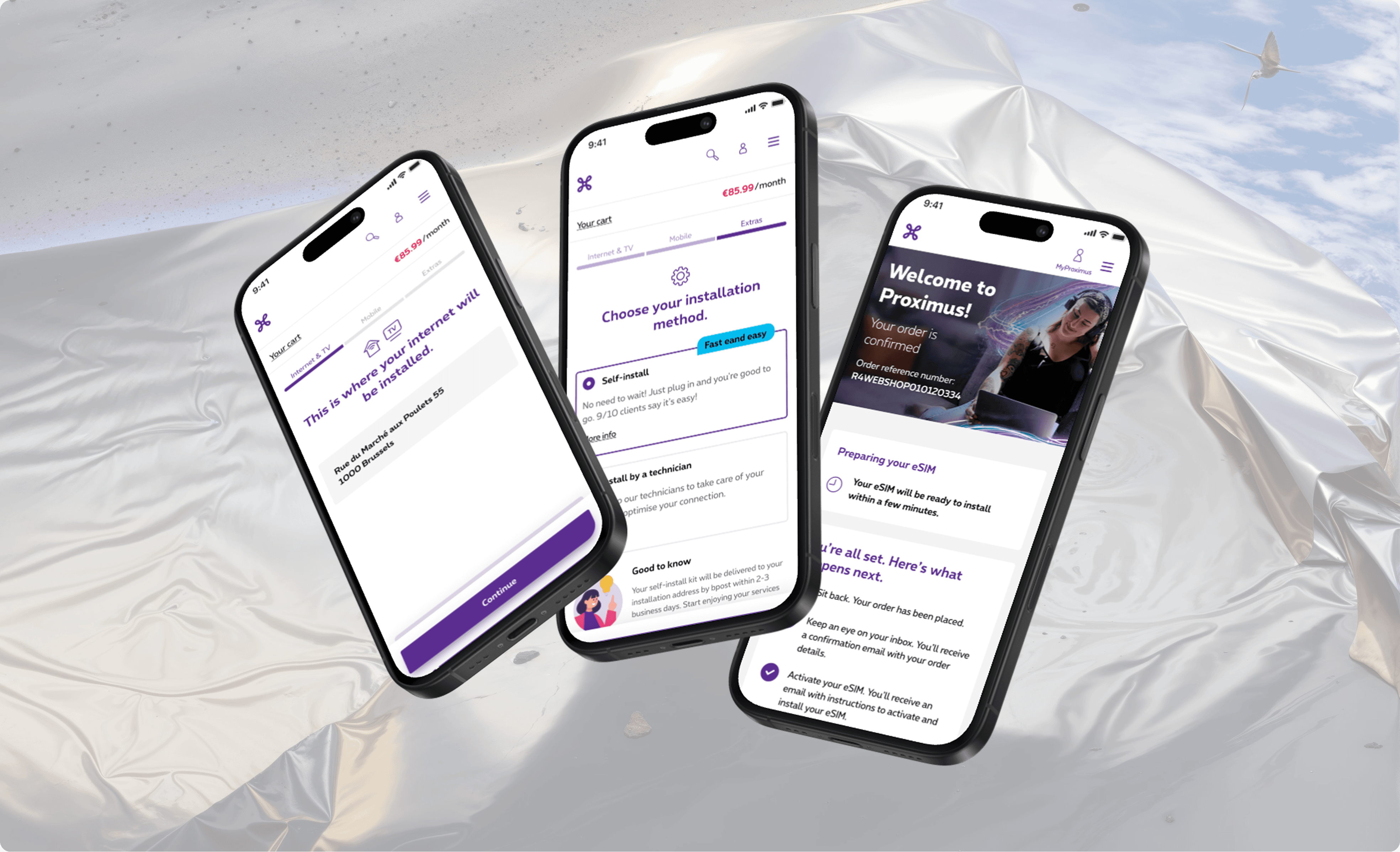
The “I radically simplify” principle wasn’t just a mantra for the top of the funnel—it extended into the most critical parts of the ordering flow, where complexity often led to frustration and drop-off. In the lower funnel, we identified two key opportunities to align with our digital-first strategy: improving the identification step and streamlining the internet installation process.
Data showed that the highest drop-off in the checkout journey occurred at the identification step. This part of the flow, managed externally and embedded via iframe, suffered from slow load times, poor mobile usability, and complete visibility loss on user behaviour—making it difficult to optimise. On top of that, user testing revealed that many customers struggled to navigate the step, particularly when scrolling within the iframe on smaller screens.
Our analysis uncovered a key insight: over 80% of successful checkouts used itsme, Belgium’s leading digital ID method. Instead of maintaining multiple complex flows, we made a bold but data-driven decision to simplify identification by prioritising itsme as the default method.
This shift not only reduced maintenance overhead and eliminated dependencies on third-party teams but also aligned with growing digital adoption. With full control of the step, we integrated tools like Contentsquare and Adobe to regain data visibility and continuously improve performance.

Towards self-servicing
Another key friction point was the delay in internet installation, particularly for fiber customers. While Proximus continued to expand its fiber footprint, many eligible customers still experienced long wait times due to technical complexities and scheduling issues—one of the top pain points reflected in NPS feedback.
In response, we partnered closely with squads responsible for the installation process to co-create a more flexible and transparent solution. Though a self-installation method technically existed in the legacy flow, it was inconsistently offered due to backend issues. We reworked the logic and interface to only surface the self-installation option when eligibility was confirmed, avoiding false expectations.
Customers with eligible fiber addresses were then given the choice to set up their modem themselves for free, or opt for technician installation at an added cost. If ineligible, the system would automatically default to free technician installation.
We also addressed the psychological barrier: reassurance. Testing showed that while many users were interested in self-installation, they lacked confidence in their technical abilities. Our revised interface clearly explained the process, benefits, and simplicity of the self-installation method—resulting in a doubling of self-installation selections post-launch, even in the absence of price incentives.
By simplifying backend logic and clarifying the user-facing experience, we not only streamlined the funnel but also improved customer satisfaction and reduced operational costs—bringing the digital strategy to life in a tangible, impactful way.

Impact
While this project remains ongoing and in continuous improvement, its impact on Proximus has already been significant - both in addressing the original challenge of declining eShare and in redefining the company's internal ways of working.
One of the most transformative outcomes was the introduction of a new governance model, born out of necessity to enable faster, more collaborative decision-making. This model didn't just improve workflow - it fundamentally changed how strategic decisions are made at the leadership level and redefined how product, tech, and design teams collaborate. Most notably, it solidified the role of design as a critical driver of business strategy and problem solving, not just execution.
From a performance standpoint, the redesigned Internet and Pack product flows are showing steady progress. Conversion rates—particularly for internet—are trending positively and in line with the company's growth targets, suggesting we are on the right path toward regaining Proximus' lost eShare. The uptake of the self-installation method has more than doubled, and our fiber-first strategy has contributed to a significant NPS scores around internet and and reduced operational overhead.
In addition, we continue to observe a consistent drop in support calls related to internet products - indicating that the simplified journeys and clearer product information are helping customers complete their orders with greater ease and confidence.

Personal reflection
Despite the progress we've made, we recognise that digital behaviour and the market we design for - is never static. Telecommunications, like the users it serves, is in constant motion. That’s why we continue to hold fast to our guiding principles: radical simplification, data-informed decision-making, and continuous user validation.
As we scale the ordering flows to include more products and services, and shape a dedicated digital strategy for existing customers, the complexity of our work grows. More stakeholders, deeper technical interdependencies, and ever-changing expectations push us to keep reflecting, iterating, and adapting.
Through this project, design has firmly earned its place at the strategic table. No longer seen as just an executional function, design is now recognised as a vital partner in solving business problems, shaping digital strategy, and connecting meaningfully with users.
On a personal note, this remains one of the most challenging and rewarding projects I've worked on - full of moving parts, tough trade-offs. Yet the progress we've made speaks volumes about the power of cross-functional collaboration and a shared vision.
In a time when questions about “the death of UX” are prevalent, this project has reaffirmed that our role isn't disappearing - it's evolving. We are no longer just outlining user journeys or designing components - we are shaping the systems, structures, and strategies that define business in the digital realm.
Our value lies not only in what we make, but in how we think - and in the questions we dare to ask.
