
Digital transformation
Service Design
User Research
UX/UI
This case study explores how redesigning the onboarding flow for Proximus’ Internet kot offer streamlined the student journey, reduced operational strain, and drove digital growth.
Framing the challenge
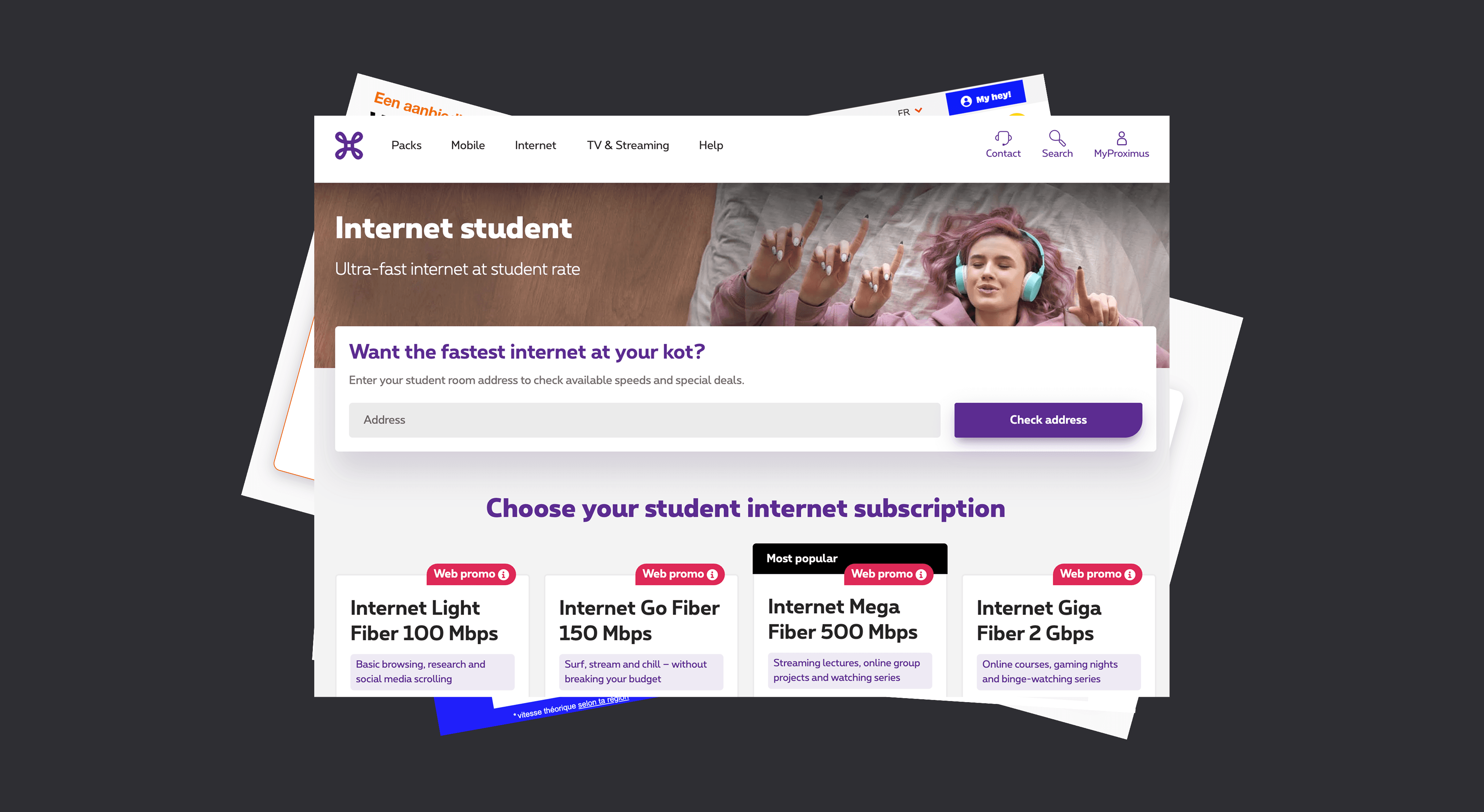
Every year, thousands of students across Belgium search for affordable internet as they begin their studies. Proximus’ Internet kot offer was designed to meet this need with a discounted subscription tailored to students. But while the offer itself was attractive, the ordering experience was not.
Students had to complete a webform, upload proof of enrolment, and wait for manual validation by a back office agent. Though the process started online, it was far from seamless. During peak periods—from July to September—delays often stretched beyond a week. For a generation accustomed to instant access, the friction proved costly: many abandoned their order or turned to faster competitors. Internally, agents were overwhelmed by repetitive, manual tasks that diverted resources from other operations.
This project set out to solve a clear problem: how might we simplify and accelerate the digital ordering experience for our student offer, while reducing the operational burden on agents?
By rethinking the end-to-end journey and fully digitalising the process, we aimed to deliver a faster, more intuitive experience for students—and a more scalable, cost-efficient solution for Proximus.

Understanding the Business Context
To fully grasp the impact of this problem, I worked closely with the marketeer responsible for student offers to understand the broader business stakes. In recent years, Belgian telecom operators have increasingly recognised the strategic value of targeting students. Since the COVID-19 pandemic, all operators have have introduced student-specific or reduced offers to capture early loyalty from this digital-first and price-sensitive audience.
The rationale is simple: starting university marks a key moment of independence. For telecom providers, it’s a prime opportunity to build long-term relationships with new customers at the start of their adult lives.
The pandemic only sharpened this need. With courses moving online, a fast and reliable internet connection became essential. This heightened expectations—not just for value, but for a frictionless digital ordering experience.
Internally, the stakes were just as high. Each year, the semi-manual onboarding flow for Internet kot created a bottleneck during the busy summer-to-October period. To meet demand, Proximus had to increase back office capacity by up to 15%, often hiring temporary support. Not only did this represent a significant operational cost, but it also diverted resources from other teams, reducing service quality elsewhere.
Improving the student ordering experience wasn’t just about meeting customer expectations—it was a strategic business move to stay competitive, reduce operational strain, and deliver on Proximus’ promise of digital simplicity.
Understanding the Current User Context
With the business case clearly defined, I turned to the user experience to understand how the existing process was impacting prospective students. My starting point was the Voice of the Customer portal—an internal tool collecting feedback on the onboarding and activation experience. I also analysed responses from an exit survey embedded in the existing webform and launched a dedicated student survey to dig deeper into user pain-points.
The findings were clear and surprisingly consistent. The main issue was not just that the process was long, but that it felt fragmented and uncertain. Students were asked to submit their request via a webform and then wait, sometimes up to 10 days, for confirmation from the back office before they could proceed with their order. For many, this meant having to pick up where they left off days—or even weeks, after first expressing interest.
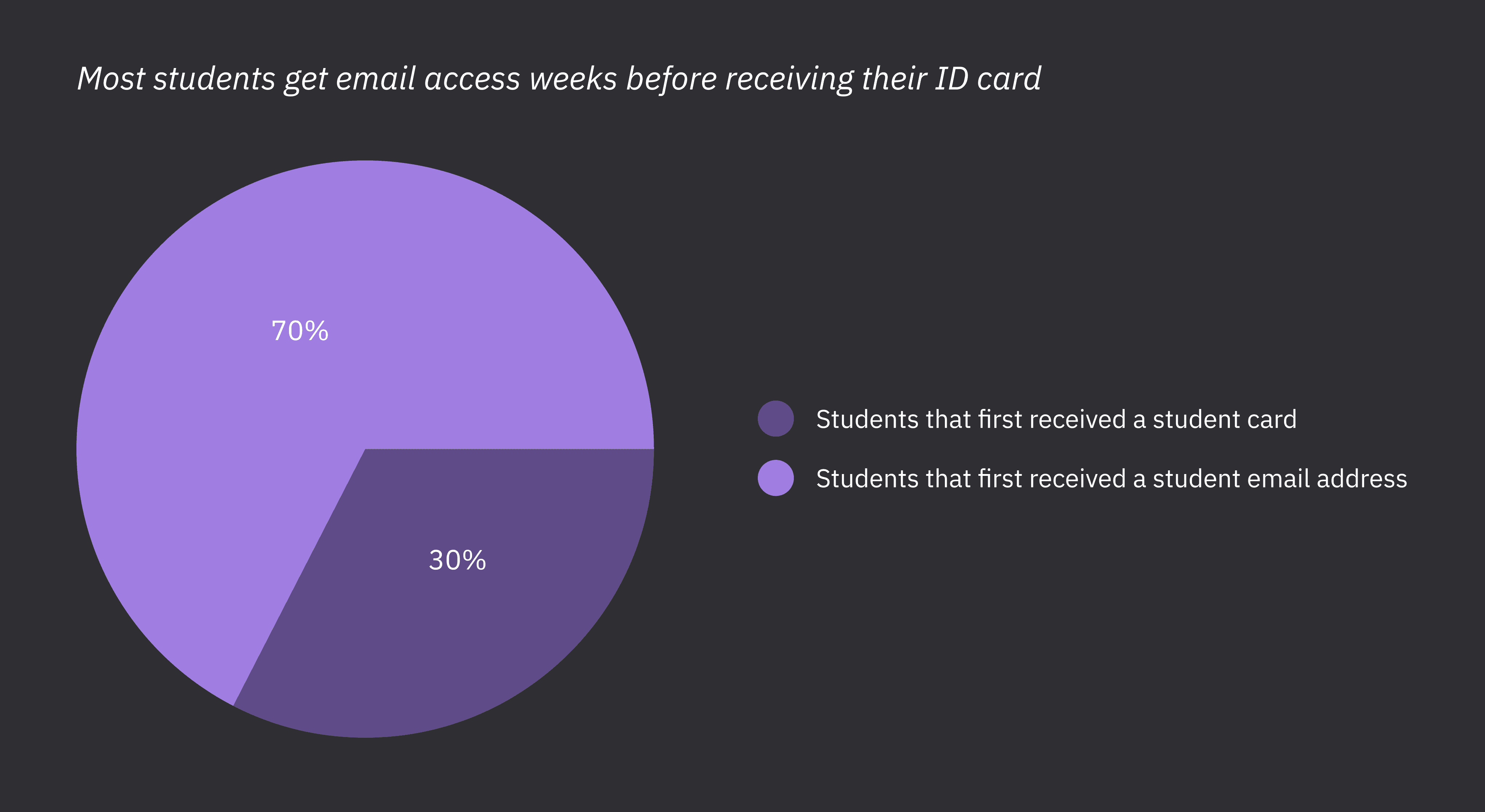
Survey results confirmed that this delay didn’t match user expectations. Students expected to complete their order on the spot and found the long form and waiting period off-putting. Crucially, many students didn’t yet have the required documentation—particularly a student ID card—when attempting to order. Most only received it at enrolment, close to the academic start date. However, they typically had access to their student email address much earlier, making it a more viable point of eligibility.
These insights made it clear: the existing journey was not just inefficient, it was misaligned with real student behaviour.

Defining the Solution
It was clear the existing process was no longer fit for purpose, neither for students nor for Proximus. The fragmented, manual ordering flow introduced friction for users and placed a recurring strain on internal teams during peak demand periods. An automatised solution was needed, but simply translating the current process online wouldn’t solve the underlying issues.
The challenge was clear: how might we create a fully digital, straight-through ordering flow that confirms a student’s eligibility without requiring manual validation or risking fraud?
My research revealed a crucial behavioural insight: while most students did not receive their student ID until late September, they often gained access to their official university or school email address much earlier. This opened the door to a more timely and seamless solution.
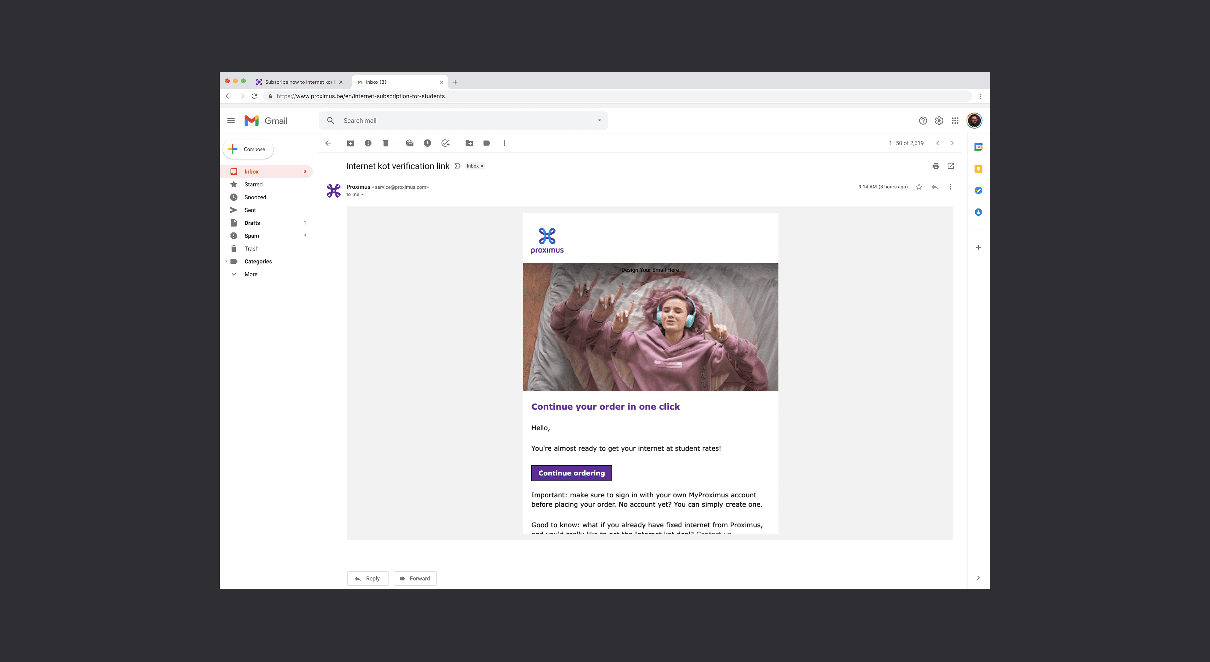
We redesigned the flow around this early-access point. At the start of the ordering process, students would enter their institutional email address. The system would then check the domain against a verified list of educational institutions. If matched, the student would receive a verification email containing a secure link to proceed and complete their order.
This two-step validation confirmed that the user had access to a legitimate student email account, thus eliminating the need for document uploads and back office checks. The result was a faster, more intuitive ordering experience that aligned with user behaviour, reduced operational pressure, and safeguarded against fraud.
Design Decisions
To create a smoother experience, we restructured the flow around familiar digital patterns. The long webform was replaced with a single step asking students to enter their institutional email address. If the domain matched our approved list, a verification email was sent, enabling students to complete their order online.
To account for students who didn’t yet have a school email, particularly those student attending schools in neighbouring countries whose domains we could not access, we kept the original webform available as a fallback option.

A confirmation screen followed the email input to reassure users and clearly outline the next steps. This two-step process mirrored common authentication flows, making it both secure and easy to follow.
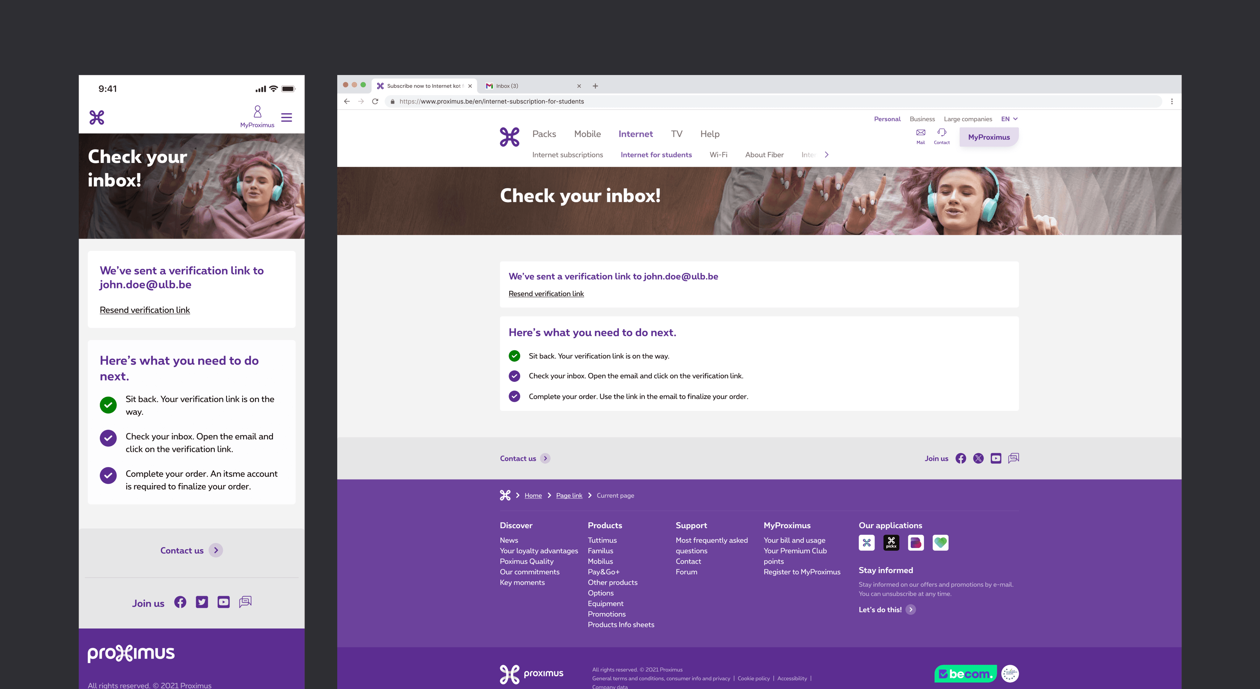
The verification email was deliberately designed with minimal content and a clear call-to-action to keep users focused on finishing their order without distraction.
We also addressed pain points around installation. Research and appointment data showed that 3 out of 5 technician visits were rescheduled, causing delays and frustration. To improve the experience, we made self-installation option the default method wherever technically possible. Technician support remained available as a paid option, giving users more flexibility while reducing strain on operations.
User testing and iteration
To validate the redesigned flow, we conducted usability testing with students to ensure the solution met expectations and identified any friction before launch.
The tests focused on three key hypotheses:
Students would be comfortable providing their institutional email address.
The email verification step would feel familiar and not cause frustration.
Defaulting to self-installation would be positively received.
The results confirmed our assumptions. Students had no issue entering their student email, though they appreciated being informed earlier in the journey—ideally before reaching the order step—so they could prepare in advance. The email verification was seen as standard practice, comparable to other digital services, and posed no usability concerns.
Feedback on self-installation was mostly positive. Five out of seven participants preferred the option, valuing the ability to install their internet box at their own pace without waiting for a technician. However, a few students expressed uncertainty about handling the setup themselves.
Based on these insights, we added a note on product cards to inform users that a student email is required. In checkout, self-installation remained the default, with the option to select technician support. We launched with this flexible setup and continue to monitor behaviour to guide future improvements.

Impact
The launch of the fully digital onboarding flow in August 2023 delivered strong results across sales and operations.
Initially launched with a limited list of recognised student email domains, we saw a modest drop in webform usage. Once the domain list was expanded, successful student email entries increased by 117%, while webform orders decreased by 20%.
Verified student email confirmations rose by 264% year-over-year, contributing to a 1.6% increase in student acquisitions via digital channels, representing 10% of total internet growth during that period.
On the operational side, automation significantly reduced manual workload, saving the equivalent of 7 working days for every 330 orders, particularly valuable during peak demand.
Project Reflections
This project was a rewarding opportunity to contribute to a meaningful digital transformation—one that brought real value to both users and the business.
While the initial instinct among stakeholders was to simply digitise the existing process, taking the time to investigate user pain points through research proved essential in shaping a more thoughtful and effective solution.
One key learning was that digital transformation is not one-size-fits-all. Even the most seamless solution will not meet the needs of every user, and it is important to anticipate and design for exceptions. Accounting for edge cases, such as students without a school email, ensured we did not create new friction while solving the old.
Another important takeaway: our job does not simply end at the launch. Rather, it is the start of and it is our duty to continue to monitor the flow and track performance to ensure we are catering to users and delivering impact for the organisation
Ultimately, this project reinforced the importance of balancing business goals with real user behaviours—and designing with empathy at every step